
Every couple of weeks, another “top 10 most expensive places to insure your car” chart does the rounds. Manchester vs London. North vs South. Young drivers vs everyone else.
They make good infographics and sensationalist headlines, but they do not help anyone make an informed decision.
From our perspective, these headlines create three problems at once:
At Pebbles, we have been building data products specifically for pricing teams to cut through that noise. Our new Market Pulse service is designed to give a clean, consistent view of how market premiums are actually moving. This is what we and our clients are seeing so far in 2026.
Any “average premium by region” combines multiple layers of mix:
Each of these can materially affect the average, so comparing London to Manchester without adjusting for mix is often misleading. What matters is not the headline average, but how it is moving over time.
Market Pulse addresses mix effects directly. It tracks market premiums for one million quotes every day, built on a bespoke notional portfolio that represents your target customers. You can index premium trends to give a clean view of rate movements over time, with the absolute premium available for context, and you can segment the information by over 50 factors.
This shifts the question from “Which region is more expensive?” to:
“What is the market doing relative to us, and where is the opportunity?”
That is the question pricing teams actually need to answer.
With a consistent portfolio, we can understand rate change clearly by segments such as region.
At a headline level, the market in 2026 has followed a familiar pattern:
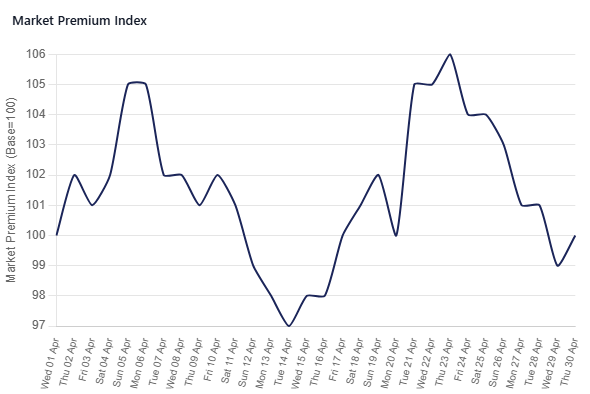
The lack of further rate increases may be premature. There is known, significant inflationary pressure on claims costs; however, it is possible that the industry assumes the observed reduction in claim frequency between 2023 and 2025 will continue through 2026. This is plausible, as there is an inverse correlation between fuel costs and driving miles, and fewer miles driven usually means fewer accidents.
Let us focus on the volatility seen in April.
By region, there are clear differences that explain the volatility noted above.
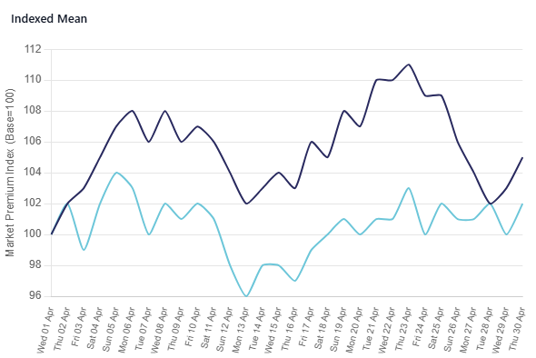
These observations have practical implications.
A map of “most expensive regions” is visually appealing, but pricing decisions are driven by momentum – where rates are moving, not just where they are.
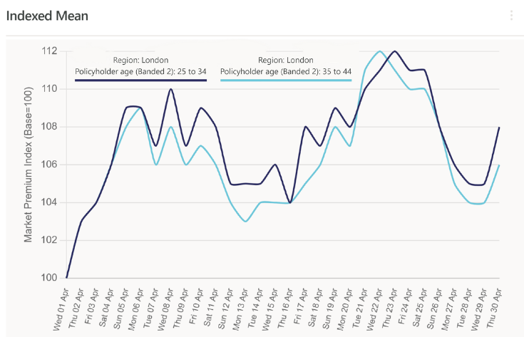
Policyholder age (or variations of it) remains one of the most important pricing dimensions, but the pattern in 2026 is not what many would expect.
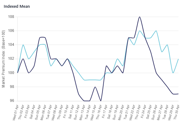
Historically, younger drivers have absorbed the majority of rate pressure. So far this April 2026, the picture is different.
In absolute terms, nothing surprising:
But the usual rate change patterns have shifted. Perhaps it is the pressure of chasing GWP, with the classic optimisation pattern of losing three £400 policies to gain one £1,500 policy. Or perhaps the reduction in frequency is concentrated at younger ages, and that segment genuinely deserves rate decreases. Either way, by seeing the rate of change in market price at a segment level, you can make informed decisions on how to meet GWP targets and move quickly to take advantage of opportunities.
With a million quotes a day, you can look at region by age and still have around 100,000 quotes on each cut – enough to make an informed decision.
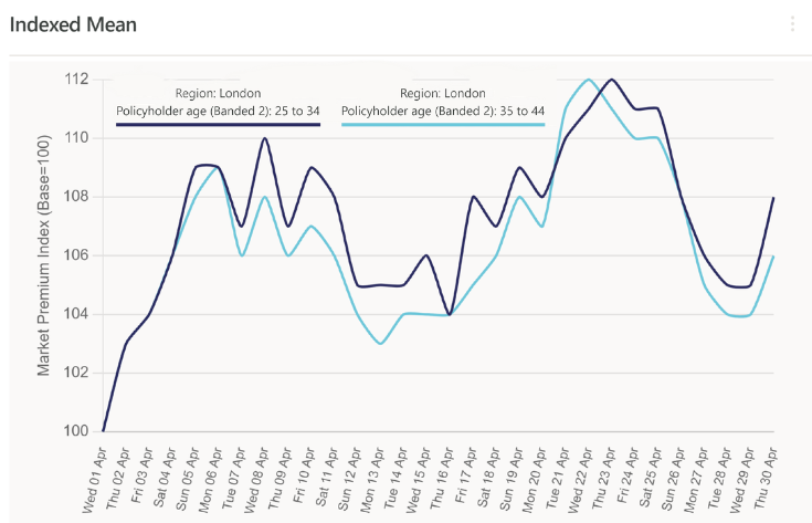
Market Pulse shows that:
Those are significant differences, especially when competing on mass‑volume channels such as price comparison websites. They create clear opportunities to grow or defend your portfolio.
Market Pulse was built to give UK motor teams a consistent external view of how premiums are moving across more than 50 common rating factors, based on one million quotes per day. It combines real quote data with Pebbles’ modelling to produce a decision‑ready view of the market.
It helps most in three areas.
The aim is simple: stop guessing what the market is doing and start measuring it every day.
The industry and the press will keep producing maps of “most expensive places to insure a car”. But if you are running a motor book, the more useful question is:
Where are rates actually moving for our target customers?
That is the question Market Pulse is designed to answer